


Lens Performance Curves
Authors: Gregory Hollows, Nicholas James
This is Section 2.6 of the Imaging Resource Guide
Understanding and calculating a lens's performance can be a difficult task. There are many variables that will affect a lens's performance, including the laws of physics, design criteria and philosophy, and manufacturing tolerances and errors. In order to obtain optimal system performance, both optical designers and the end users have access to several metrics that can be used to measure a lens’s performance. These curves are often provided to help specify the correct lens.
Modulation Transfer Function (MTF)
The Modulation Transfer Function (MTF) curve is an information-dense metric that reflects how a lens reproduces contrast as spatial frequency (resolution) varies. These curves offer a composite view of how optical aberrations affect performance at a particular set of fundamental parameters dictated by the application’s need. It is important to understand that changing almost any setting on a vision system, including the fundamental parameters, will change the performance characteristics of the curve. How MTF is calculated and the limits of MTF are detailed Modulation Transfer Function (MTF) and MTF curves; fundamental parameters are defined in 5 Fundamental Parameters of an Imaging System.
Figure 1 shows a common type of MTF curve, which describes the modulus of the optical transfer function (contrast) vs. frequency (resolution). How frequency is determined is covered in Resolution. This curve provides a broad overview of a lens's performance at a specific working distance, f/#, sensor size, and wavelength range.
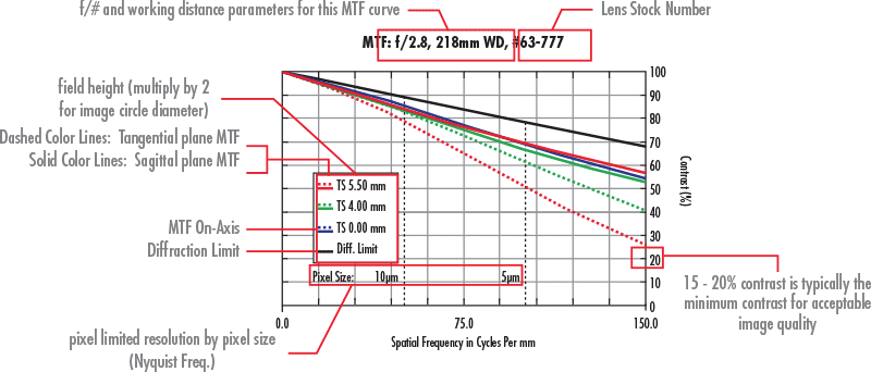
Figure 1: An MTF Performance Curve Illustrates Contrast vs. Frequency
In regards to our presentation, there are multiple colored curves (black, blue, green, and red) that are displayed. The solid black line at the top is the diffraction limit of the lens, and represents the absolute limit of the lens performance. No matter how advanced the lens performance becomes, it will never rise above this line. The additional colored lines on the curve that are below the diffraction limit represent the MTF performance of the lens. They correspond to different field heights (positions across the sensor) that are to be used. In this case, there are three different field heights represented: on-axis (blue), which represents the center of the image circle; 70% of the diameter of the image circle (green), which represents about half the image area; and the full image circle (red), which is the corner of the image sensor that is in use. Note that some curves will contain more field points for analysis.
The other noteworthy feature within the curves is the difference between solid and dashed lines, represented on the curve by the letters T and S, which represent the tangential (T: yz) and sagittal, or “radial” (S: xz) planes of focus, respectively. These fields are different due to aberrations that are caused by asymmetry, such as astigmatism, which is why there is not a separate curve for tangential and sagittal on-axis. If element tilts or decenters existed, the asymmetry would cause there to be different T and S curves on-axis, as well.
The MTF curve is a map of contrast vs. frequency. Interpretation of an MTF curve is highly application dependent.
Depth of Field (DOF)
The Depth of Field (DOF) plot displays how the MTF changes as details of a specific size (resolution, given as a frequency) move closer to, or farther away from, the lens without refocusing. In other words, how the contrast changes above and below the specified working distance. Figure 2 shows the type of DOF curve provided in TECHSPEC® lens datasheets.
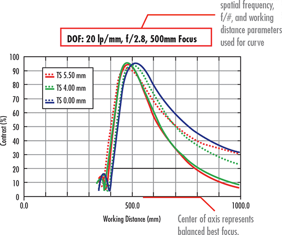
Figure 2: Depth of Field Performance Curve shows how Contrast Changes with Working Distance
The depth of field plot shows the differences in MTF based on constant field heights (the different colors of the individual curves) for a fixed spacial frequency on the image side, with the diffraction limit left out. As the MTF is sampled at different positions along the optical axis, defocus is introduced into the system. In general, as defocus is introduced, the contrast will decrease. The horizontal line toward the bottom of the curve represents the depth of field at a specific contrast level (in this case, 20%). The generally accepted minimum contrast for a machine vision system to maintain accurate results is 20%.
Relative Illumination
The Relative Illumination curve is used to quantify changes in the illumination level across the sensor. Changes in illumination can have undesired effects on the final image when it comes to analysis. Details on what causes RI changes can be found in Sensor Relative Illumination, Roll Off and Vignetting. The curve in Figure 3a shows a typical relative illumination curve, with the relative brightness (relative to the brightest point in the image) vs. field height.
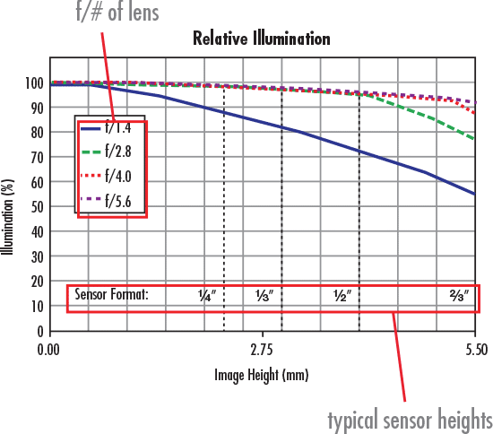
Figure 3a: A Relative Illumination Curve shows the Relative Brightness vs. Field Height at Various f/#s
The different individual curves represent the relative illumination performance based on f/#. Note that as the f/# increases, relative illumination generally increases. Be careful not to confuse this with absolute brightness, as higher f/#s will still cause an overall brightness decrease. Learn more about f/# in f/# (Lens Iris/Aperture Setting)
The x-axis represents the distance from the center of the sensor to the corner of the sensor. The y-axis indicates how much illumination exists at any position in the field relative to the point of highest illumination, typically the center of the field, set equal to 100%. In order to clarify how the lens's relative illumination will perform across different sensors, dotted lines representing different sensor diagonals have been included in the plots. Figure 3b is a projection of how the relative illumination in Figure 3a will look at f/1.4 in a real world image Learn more about relative illumination in Sensor Relative Illumination, Roll Off and Vignetting.
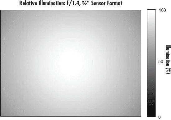
Figure 3b: This Plot shows how the f/1.4 Curve, blue in 3a, will appear across a 2/3
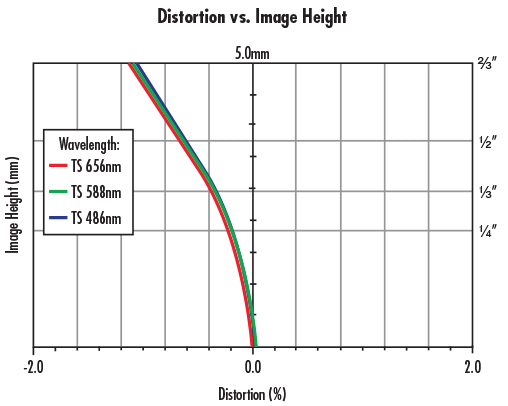
Distortion
In an imaging system, distortion causes apparent magnification changes with respect to field position. There are many ways to represent distortion, but Figure 4 shows field height vs. geometric distortion percentage, which is a typical plot that lens designers and engineers utilize to characterize distortion. Lean more about distortion in our application note, Distortion. The plot in Figure 4 shows distortion as the percentage of magnification shift (x-axis) moving from the center of the image to the corner of the image (y-axis). The larger the absolute percentage of distortion, the larger the difference between the ideal image map and the distorted one.


or view regional numbers
QUOTE TOOL
enter stock numbers to begin
Copyright 2023, Edmund Optics Inc., 18 Woodlands Loop #04-00, Singapore 738100
California Consumer Privacy Act (CCPA): Do Not Sell or Share My Personal Information
California Transparency in Supply Chains Act